Ever run around a train station desperate to buy a ticket, only to find joining the huge queue for the person behind the ticket desk is the only option? Of course you have…
However, it’s probable that your station does have touchscreen kiosks, it’s just that the station hasn’t done a good job of making them visible enough to customers.
This is just one of several mistakes that many businesses make; mistakes that can be easily avoided, so we’ve created a list to help you avoid them.
Let People See It
Mistake one is relatively straightforward: Misplacement. You’d be surprised, but many businesses don’t place their kiosks where customers can actually see them.
Because generally speaking kiosks are an optional luxury for the consumer, some companies place them in every nook and cranny. But most companies buy these in the first place to save on costs. The only way people will use them is if they can actually see them.
Make It Easy For Users
If a person is stood at a kiosk for more than five minutes, something is clearly not right. They’re meant to speed up a process in the simplest of manners. A good kiosk should guide the user through the process, whether it be making an order, collecting tickets, or checking in.
‘Next’ and ‘Back’ buttons are integral. Making them easy to navigate will allow users to have a calm, user-friendly experience. Keep stages of the processes simple; i.e. one question per screen is easier to handle than trying to answer multiple questions in one go. After all, we’ve all seen a confused old man bashing a self-service checkout in the supermarket with a baguette. Haven’t we?
Use the Right Software
You’d be surprised by how many kiosks don’t use technology that suits kiosks. Ensuring the software is suitable for touchscreen use can solve so many consumer problems. Drop down menus, small icons, and scrollbars are not suited to navigating with a finger. In essence it’s the same as visiting a desktop website on an iPhone.
Ensure that the software looks professional, yet is easy to read and easy to use at the same time. The software should be locked down so that a computer error message isn’t shown; when the operating system is hidden from the user, it makes the kiosk more secure.
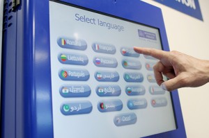
Avoid overusing text
Graphics are much more easily accessible than text. No matter what the kiosk is used for, there’s always alternatives to using text. For example, if providing directions in a shopping centre, highlight a path and use pictures like arrows rather than a descriptive direction route. Also consider adding buttons with icons behind them, like the home icon. This makes it easier for people to read and interpret, as well as overcoming and language barriers which may be present.
The user is the priority
Kiosks are made for the benefit of the user, so the main priority for the kiosk is not to frustrate them. When kiosks are difficult to use, have unhelpful search functions, have unclear navigation or a slow software, these are just a few things which can irritate customers and therefore put them off using them in the future. These problems can even result in losing sales, as often customers will give up and disregard the purchase if the process isn’t made easy for them.